Better Screen Time
This story first appeared in Xperience, the official publication of AVIXA. For more articles, take a look inside.
By Kirsten Nelson
At practically every waking moment, time in front of the screen is an integral part of our daily lives. Whether to collaborate at work, relax at home or escape both and find entertainment in the world, video imagery and its attendant sound and lighting are everywhere.
So much screen time has created an interesting phenomenon. Fatigued by the isolation wrought by so many hours in front of screens, we are seeking new connections in the world: interacting with other people and with the physical environment around us, and welcoming a more tactile experience with the objects and products in our sphere.
This is particularly true in retail and hospitality, both of which require a social element but must now deliver greater levels of immersive engagement so that people will actually look up from their screens. In these spaces, a delicate feat of design is occurring: The same technologies that feed screen time are being harnessed in new and carefully curated ways to enhance the human experience. Video, sound and lighting have long been vital to creating atmosphere; today they’re equally important for making connections, capturing attention and building a new energy that keeps people coming back for more.
Neiman Marcus Tries Digitally Interactive Shopping
 A pioneering brand in the luxury retail space, Neiman Marcus has cultivated a chic and inviting vibe for more than a century. Shoppers who visit
any of its 42 locations have come to expect both the warmth of the store’s Texas roots and the cool sophistication of fine wares in opulent surroundings.
Since opening its doors in 1907, Neiman Marcus has proudly evolved with the times, proclaiming that it continues to “stay true to the principles of our founders while reinventing the shopping journey for the luxury customer of today and tomorrow.”
True to form, Neiman Marcus recently experimented with a new interactive shopping experience. As they visited various departments, shoppers were greeted with a new form of retail spectacle intended to attract attention and sense their interest, and further, provide information in an engaging manner. While this may sound like a regular encounter with a sales associate (and there are still plenty of those to keep people happy at the stores), this was actually a technological interaction.
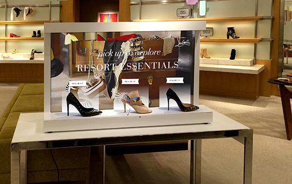
Elevating the trend of video displays in retail to a more Neiman Marcus level, the store field-tested what’s known as the “Perch Shelf.” Not just any shelf, the platform includes a 48-inch interactive touch screen, embedded in an aesthetically pleasing design in the retail display that enhances the sophistication of the space.
The shelf and display are powered by technology developed by Perch Interactive, a provider of customized dynamic video experiences for retail. The elements of each Perch Shelf are carefully calibrated to match a brand’s style, engage customers and deliver content that furthers a business goal. It also has built-in analytics to help retailers discover what works and what doesn’t when trying to drive sales.
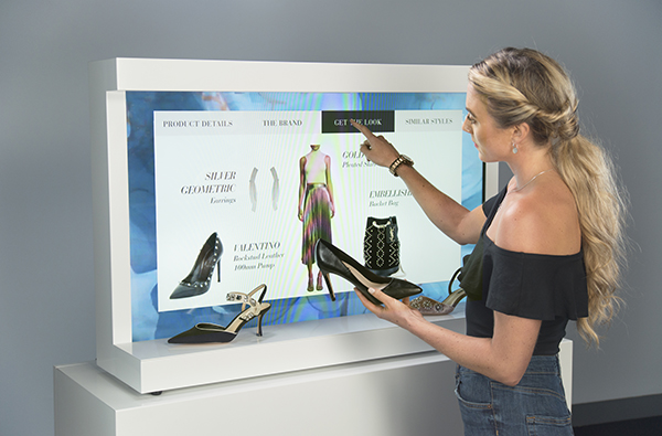 Shoppers are lured by customized content to move toward a sales display and pick up an object, such as a high-heeled shoe. This action prompts a
sensor to trigger additional content relevant to the shoe, which further encourages the customer to learn more about the brand, including product details, color options, pricing and related styles. The interactive display can also suggest clothing
and accessories to complete a look.
The information-rich experience is similar to browsing product options on a website, but with the added bonus of the tactile experience and the opportunity to consult with a sales associate for more context or to try things on for size.
“It’s a holistic approach,” says Trevor Sumner, CEO of Perch Interactive. “We create tools that help the sales associates. This is a trend we’re seeing across retail…. Every time you have friction in the process, you have fall out. You need to look at what are the frictions and what are the joys that we need to complete a purchase.”
Digital displays are essentially blank canvases that can be updated frequently without much overhead. Each object on a shelf can relate to separate content, optimizing that space for information and branding.
Evidently, Neiman Marcus’s foray into interactive displays yielded positive results. According to numbers shared by Perch, there was a 20 percent increase in handbag sales, a 39 percent boost in women’s shoes purchases and a 45 percent increase in sales of men’s footwear over the testing period. Moreover, customer engagement and dwell time were measured at 6 to 14 times what they were with traditional displays.
“It’s all about connecting the different experiences and throwing out the idea that the physical and the digital are separate channels,” Sumner explains. “It’s about recognizing that the customer is the channel.”
Connecting a Community at Ace Hotels
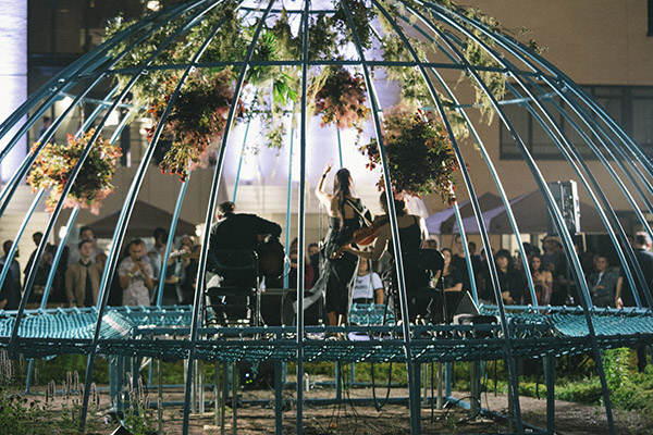
Ace Hotel Chicago
Credit: Alexa Viscius
A haven for creatives since its first location opened in Seattle in 1999, Ace Hotel continues to cultivate its reputation as a contemporary refueling station for artists on the road and the locals who collaborate with them. As this hospitality innovator has expanded globally, its locations have become gathering places for those who follow their passion for a living. The New York Times recently credited the hotel with having pioneered coworking spaces, creating a collaborative and cozy vibe in its lobbies, and encouraging productivity with caffeine and sundry provisions such as Wi-Fi and handy power outlets.
But people don’t congregate in the Ace Hotel lobby because of the power outlets. They settle in because of the atmosphere, and that atmosphere is especially resonant because of Ace’s foundational connection with local culture, specifically as expressed through music.
“Music has always been part of Ace’s roots,” says Ryan Bukstein, Vice President of Brand at Ace Hotel Group. “We started in Seattle as a place for bands, artists and creatives to come through while on tour, and this ethos has been a guiding pulse ever since. We think of hospitality as friends taking care of friends, and that includes a sonic experience — we don’t think of music as a tool so much as an aesthetic and soulful necessity.”
In fact, Ace has expanded its brand into dedicated music venues with advanced sound and video technology, including the Three Keys club at its New Orleans location and the carefully restored 1920s-era United Artists movie palace at its downtown Los Angeles location. Now known as The Theatre at Ace Hotel, the ornate 1,600-seat venue with a full cinema projection and audio system has become a destination for both L.A. locals and global fans.
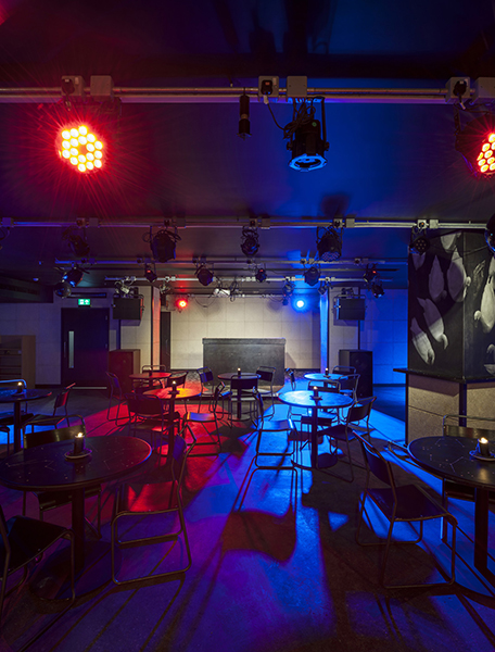
Ace Hotel London
Credit: Andrew Meredith
Most recently, the hotel launched the Double Vision festival at its Chicago location, programmed as an extension of two of the city’s largest annual live music events. “We wanted to create a space for visiting artists to connect directly with the community through the activation of our public spaces in performances, DJ sets, visual art and more,” Bukstein says.
The Ace Hotel also provides support for audio recording through its Studio A program. Hoping to encourage artists to experiment and record new works during their stay, the program provides loaner recording gear such as mics, synths and mixers. “Groups like Flatbush Zombies have utilized Studio A to create films and music at the hotel,” Bukstein notes, adding that there are plans to build dedicated recording studios in future locations.
The collaborative spirit at Ace also extends to visual arts, with projectors available in many of its public spaces for artists and DJ guests to utilize, and a long list of spectacles such as the Joshua Light Show in London and several live music accompanied screenings at The Theatre at Ace in Los Angeles.
In the crowded Ace Hotel lobbies, guests are encouraged to participate in all kinds of technology-based arts; the spaces are often used for code-athons and other gatherings geared toward new segments of creators and makers. “At Ace, we respond and add to the beautiful noise in our communities, offering a platform for local and international artists and fans to come together and celebrate the abundance of talent in unique, compelling and multilayered ventures,” Bukstein says. “As individuals, we’re super fans. In this way, there’s no separation between who we are and what we do.”
Tut Exhibit is a 21st-Century Experience
For the 100th anniversary of the discovery of King Tut’s tomb, the pharaoh’s most dazzling objects of 3,300 years ago have met with modern spectacle in a new touring exhibition that will hit 10 cities around the globe. The show’s more than 150 artifacts, 60 of which have never previously left Egypt, shimmer in any light, but as they travel the world on this unprecedented six-year run, they’ll have some extra help from technical showmanship.
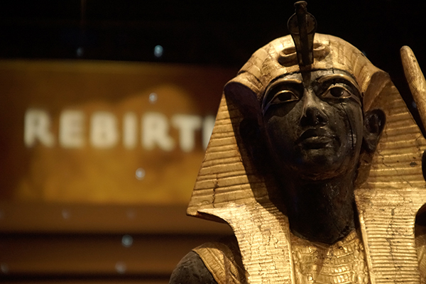 With all the elements of a full-scale touring stage show, IMG’s production of King Tut: Treasures of the Golden Pharaoh was carefully
calibrated to deliver on the tactile promise of precious historical objects while also satisfying the modern craving for immersive entertainment.
The job of readying the electronically enhanced pedestal for this latest globe-circling jaunt of Tut’s fascinating ephemera was awarded to Canadian systems integrator Design Electronics. In selecting the technologies that would spotlight artifacts and captivate visitors’ attention, the focus was always, “How could we take these amazing artifacts and have the electronics — audiovisual, sound and lighting — enhance the experience,” says Khalil Williams, General Manager of Design Electronics. “We wanted to paint the picture with sound and video, and take the guest there by creating an immersive environment that engages several of the senses.”
That immersion begins with the show’s intro theater experience, which features a 180-degree video presentation designed to create an “ethereal” effect with tales of stars and gods. To achieve the feeling, Design Electronics opted for a 23-foot-wide, 7-foot-tall curved screen that was raised so viewers were gazing upward as if into a night sky. Additionally, another layer of sensory experience was added to complete the effect: “We use sound to spatially create the effect that you are passing along with Tut,” Williams explains.
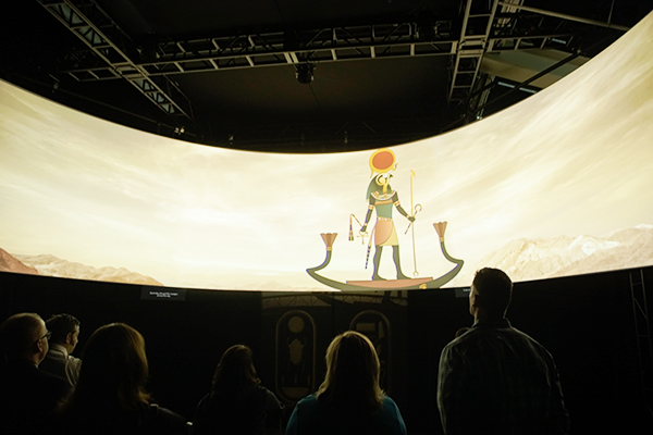 Sound and video are paired together in various ways throughout the exhibition, helping to carry the thread of a mystical experience. The massive
show, which will often be housed across multiple floors of the museums it visits, required some extra finesse to maintain the spell as visitors take escalators to other levels.
Designed to entrance visitors as they enter more exhibits focused on discovery and archaeology, “The Wishing Cup” 3D immersive experience features projections that appear as if glowing across an opaque surface. Spoken narration explains why the artifact was hidden, explains Williams, and “then there are sound effects, like something is being chiseled away. And as it’s chiseled, the opaque image falls away, and you see the reveal to the tomb,” he says. The illusion was created in collaboration with exhibit designer Fricker Studio, fabricator Cinnabar and lighting designer Brad Malkus of Lightswitch.
The Tut exhibition was such a crowd-pleaser, its closing date and opening hours were extended at its premiere location at Los Angeles’ California Science Center. It has now moved on to its European engagement, where in March it opened at the Grande Halle de la Villette in Paris. Having spent time observing visitors as they traveled through the exhibit, Williams notes, “It’s interesting, because you do get the ‘wow’ moments with the technology, but you also very much get the ‘wow’ moment with the artifacts. The blend of the audiovisual and the actual artifacts helps visitors understand why the artifacts are so important. It’s essential to give people a reason to get out and leave their homes — just like going to see a movie, you want to have the best audiovisual experience.”


